HORDE
Crafting a new name and brand for a surveying firm wanting to break through the noise.
Solutions
2025
Breaking Through Industry Barriers
Client
HORDE
Location
England, UK
Sector
Surveying
The Goal
HORDE, an ambitious and disruptive surveying firm, approached us with a unique challenge: to help them break free from the traditional naming conventions in their industry, often built on legacy surnames, and instead craft a bold, modern brand that reflected the collective strength of their team.
Our mission was to guide them through a full strategic and creative transformation. This meant running brand workshops to uncover their identity, proposing market-ready naming options, and delivering a complete brand experience that could confidently speak to two distinct audiences: commercial clients and home services customers. The goal wasn’t just to rename a business, but to ignite a movement in the surveying space.


Our Solution
A Brand Built on Collective Strength
We began with an immersive brand workshop, getting under the skin of their values, ambitions, audience, and industry context. Through this session, it became clear that their greatest asset wasn’t a single founder, but the collective force of their team.
From this insight, we created five market-viable names. The standout? HORDE.
HORDE symbolised more than just a team; it captured a mentality.
A collaborative, intelligent, and powerful unit of people, internally and externally.
The naming decision laid the foundation for a tone of voice and visual language that would challenge the norms of the surveying industry. From there, we built a brand identity system that could scale confidently across every touchpoint, print, digital, social, and site signage, while housing a dual-audience platform for both commercial and residential clients.


Defining objectives
We wanted to understand HORDE as more than a business, so we explored the ethos behind their collaborative approach, the gap in the market for modern, people-first surveying firms, and the need for clear, differentiated messaging between their two audience groups.
The strategy was to unify brand, tone, and digital presence in a way that felt modern, scalable, and rooted in their people.
Advantages
This strategic foundation allowed us to build a brand and platform that:
– Communicated trust and authority to commercial clients
– Simplified complex services for residential users
– Elevated HORDE’s distinct voice in a crowded, traditional space
From typography to tone, the result was a brand that’s both professional and approachable, built to reflect the strength of the many.
Be Brave
We made a bold decision to move away from founder-led naming and build a collective identity. This not only set HORDE apart in their industry, but also allowed the brand to grow beyond individuals, towards a reputation based on team strength and shared success.
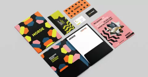
The name and brand mark were developed with this in mind: strong, flexible, and visually striking. The colour palette uses charcoal and cool grey to ground the brand in professionalism, while electric yellow injects energy and edge, signalling change and confidence.
Be Human
The design system we crafted for HORDE puts people at the centre. Custom line-based illustrations and iconography reflect the technicality of their work, while also adding warmth and clarity.
Typography choices balance geometric structure with humanist touches, providing a nod to both precision and personality.
The tone of voice was meticulously crafted to be:
– Clear but not cold
– Professional but never pretentious
– Direct but always inclusive
Be Agile
The digital platform was shaped through close collaboration with the HORDE team. We created a user experience that speaks directly to their two core audiences, offering tailored content and clear navigation from first click all the way to enquiry.
Key features included:
– Dual-entry homepage journeys
– Modular content blocks for flexibility
– Responsive design with high contrast and intuitive flows
– A CMS system allowing in-house updates and scalability
Through strategy, innovation and creativity we take your brand on a journey of discovery and transformation that leave a lasting impression and drive behaviour.
Our brand projects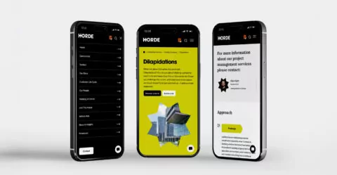
The Result
HORDE now stands as a confident, modern brand in a field that rarely dares to look different. The name, identity, and digital platform reflect a new standard for what a surveyor can be: collaborative, transparent, and united in purpose.
From the very first workshop to the launch of their new platform, this project has been a journey of transformation. We didn’t just rename a business.
We helped spark a movement.