Stripes
A purpose-driven rebrand reframes ADHD as a strength and gives Stripes a bold, accessible identity.
Solutions
2026
An impactful new brand that champions those with ADHD
Client
Stripes
Location
Yorkshire, England
Sector
ADHD Charity
The Goal
Stripes (previously the West Yorkshire ADHD Support Group) is a small charity supporting adults, children and families in the ADHD community across West Yorkshire. As demand for their services grew, their existing identity no longer reflected who they were or how they wanted people to feel when they first discovered them. They needed a new name and brand that felt welcoming, inclusive, and modern, while clearly signalling their support for people with ADHD at every stage of life.
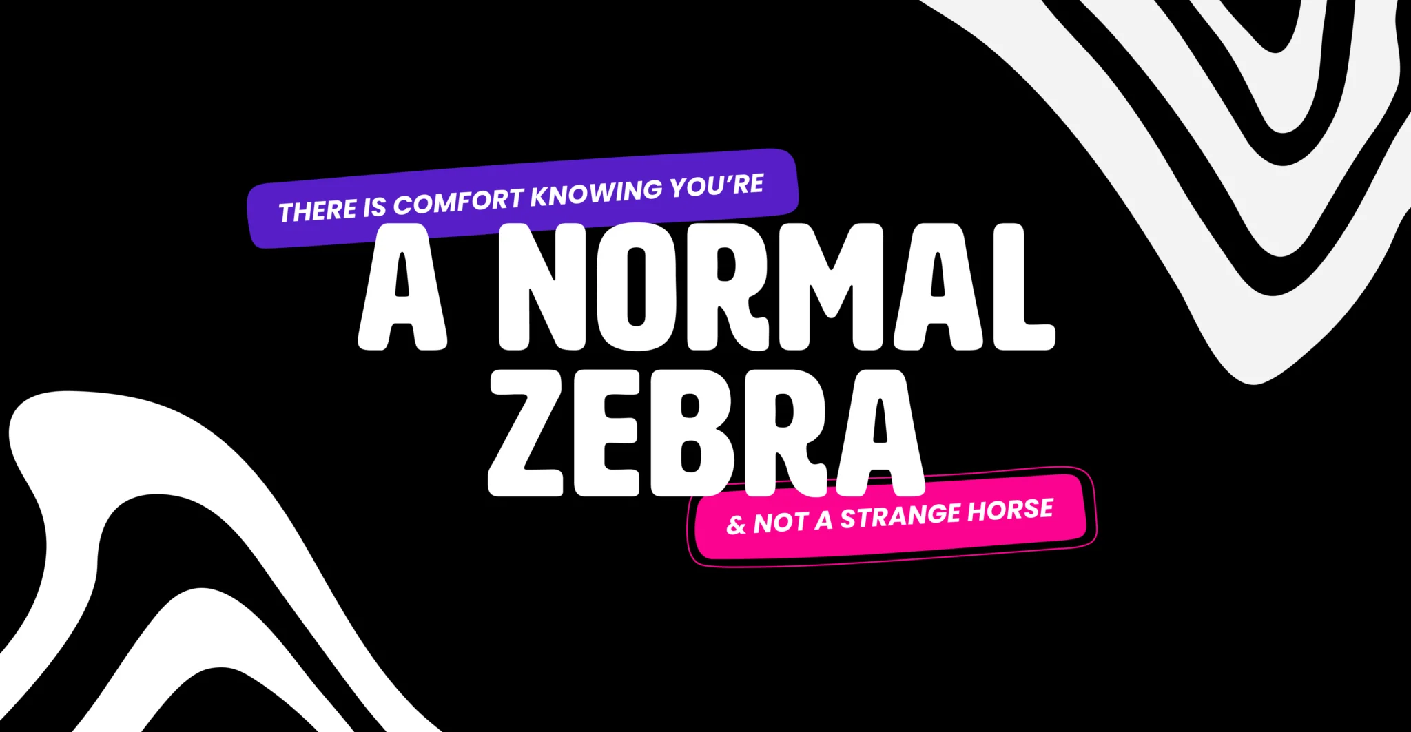
Working closely with the charity, the Fishtank team helped them become Stripes: The West Yorkshire ADHD Charity, a community-shaped name built around the idea that ADHD is part of who you are rather than something to hide. The goal was to create a user-friendly, easily recognisable identity that reframes ADHD as a strength and gives people the reassurance that they are “a normal zebra, not a strange horse”, building trust with adults, children, parents and carers alike.
The Challenge & Strategy
The initial brief was short and open-ended: a rebrand, a new name and a logo to match; however, it quickly became clear that the real challenge was much bigger. The brand needed to speak to a wide audience of adults with ADHD, children and young people, parents, carers and professionals and give each of them something that felt both reassuring and energising. Stripes also wanted a character that younger audiences could connect with, presented in a way that still felt credible for adults, and an identity that could work just as hard on social posts and flyers as it does on hoodies and community events.
Accessibility was just as important as personality. Fonts and layouts needed to be friendly for people with ADHD and dyslexia, avoiding visually overwhelming patterns and cluttered pages while still feeling vibrant and upbeat. The Stripes team proudly saw themselves as “the pink people” and wanted that to remain, so the colour palette had to hold onto their hot pink while staying calm and legible. Our answer was to refine the brief through conversations, explore the lived experience of ADHD and dyslexia, and design an identity system that is emotionally uplifting and functionally inclusive at the same time.
The Solution
Our design team explored multiple creative routes before shaping a type-led identity built around the new name Stripes and the strapline “Your Stripes Your Strength”. The core logo gives the word Stripes room to breathe, with the strapline sitting alongside it to capture the idea that ADHD traits can be a source of strength rather than something to explain away. A series of zebra-inspired stripes runs through the wider system, turning the “normal zebra, not a strange horse” metaphor into a recognisable visual thread that shows up in backgrounds, borders and supporting graphics.
The mascot brief was one of the trickiest parts. The charity wanted a cartoon-style zebra, so our designers focused on creating a versatile character that feels warm and approachable in children’s contexts while still sitting comfortably alongside more grown-up applications. Through rounds of iteration and feedback, a zebra character emerged that can appear as a simple head within the logo or as a fuller illustration in campaigns and community materials. Scattered coloured “pop-ups” and shapes were introduced as deliberate attention guides, making layouts feel lively without becoming overwhelming. The rollout extended into a full toolkit: business cards, letterheads, social graphics, story templates, hoodies, t-shirts and badges, so that Stripes had everything they needed to take the identity into their community.
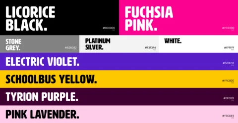
Typography choices were made with care. The team selected dyslexia friendly fonts, including Poppins for subheadings and body copy and a tested headline face, and worked with both internal colleagues and client contacts with lived experience of ADHD and dyslexia to check legibility and comfort. This focus on accessible type and layout gives Stripes clear, readable communications across print and digital touchpoints, supporting everything from information sheets to social posts. The colour palette retained a bold hot pink at its core, balanced with supporting tones that keep layouts bright but controlled, helping Stripes feel like the same “pink people” in a more confident, consistent way.




Defining objectives
From the outset, the design work was grounded in the realities of living with ADHD. The team explored how attention, focus, and visual processing can be affected and used that knowledge to avoid overly busy patterns, clashing colours, or dense layouts that might feel overwhelming. Conversations with the charity highlighted the importance of making adults feel respected and children feel welcome, all while removing some of the stigma that can still surround ADHD.
Our designers, account managers and the Stripes team brought people with ADHD and dyslexia into the process wherever possible. Internal colleagues helped test font options, while client contacts sense-checked legibility and comfort against their own day-to-day experiences. These inputs helped define the balance between playful and clear, and guided decisions on everything from type hierarchy to how much pattern and movement should appear on a given piece of communication.
Advantages
Our research led to a brand that feels like it belongs to the community it serves rather than being imposed from the outside. Fonts are easier to read, layouts work with shorter attention spans, and the zebra metaphor offers a simple, positive way to talk about neurodiversity with both adults and children. By grounding design decisions in lived experience, the identity feels respectful, empowering and straightforward for the charity to use.
The same insight shaped the tone and messaging. “Your Stripes Your Strength” gives Stripes a clear line to rally around, and the visual language supports conversations that focus on acceptance and confidence rather than deficit. This combination of emotional clarity and practical accessibility has helped the charity feel more confident in how they present themselves online, in print and at events.
Be Brave
The visual system blends sophistication with playfulness to create a brand that stands out without losing its warmth. Bold typography, a confident, hot pink-led palette, and the zebra character give Stripes a distinctive presence, whether they are sharing updates on social media, printing posters, or producing hoodies for volunteers. Two distinct creative routes, one more type-led, one more illustrative, were combined, giving the final identity both the structure and the charm the charity needed.
Be Human
Every design element keeps people at the centre. Dyslexia-friendly fonts, generous spacing, and carefully placed colour blocks make information easier to process, while scattered coloured pop-ups gently pull focus rather than compete for it. The mascot and strapline work together to help adults and children see ADHD as something to understand and embrace, not something to hide, making the brand feel honest, approachable and emotionally resonant.
Through strategy, innovation and creativity we take your brand on a journey of discovery and transformation that leave a lasting impression and drive behaviour.
Our brand projects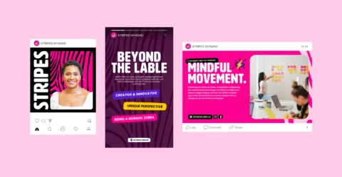


The Result
A brand that champions ADHD
The rebrand has transformed Stripes from a straightforward support group identity into a more impactful, user-centred brand that better reflects its community and mission. The charity’s reaction was strongly positive from the first presentation, and seeing the logo, mascot, patterns and typography come together in animation and across social posts reinforced their confidence in the new direction. They felt the brand looked and felt like them, and were grateful for a system that they could continue to use and build on.
The work has also been recognised beyond the charity itself. Stripes was shortlisted at the Prolific North Creative Awards in the Creative for Good category and at the Prolific North Champions Awards for Social Impact Campaign of the Year, highlighting both its design quality and its social impact. Internally, the project has become a benchmark for how Fishtank approaches purpose-led work, influencing how early briefing, discovery and mood boarding are handled so that future charities and community organisations can benefit from a more streamlined, collaborative process.